Koish Sports - Character Design
Koish Sports is a Chinese sports brand operating pickleball and tennis courts. I joined on a contract basis to help build their social media presence through character-driven content for WeChat and other Chinese digital platforms.

What started as a sticker brief turned into a full character system. By the end of the project I had designed two distinct mascots, a complete IP design framework for each, a sticker set of animated GIFs, and a concept for a shared social media universe built around both characters.
Project Timeline
May 2025 - October 2025
Project Brief
The stakeholders had already gone through one round of character design — two ball-shaped mascots representing pickleball and tennis. They were not satisfied with the result. My task was to start fresh with a new direction and deliver a sticker pack ready for WeChat.

I was given creative latitude on the character direction, which meant the first challenge was figuring out what the right mascot actually looked like before designing anything for it.
Character Exploration
I explored several directions before landing on the cat concept — a generic character, a fish-inspired design, and variations on the cat form across body proportion and personality. The calico cat emerged as the strongest direction. Its spotted pattern directly references a pickleball's surface, grounding the character in the sport without being literal about it. The stakeholders approved the direction and I moved forward.
Expanding the System
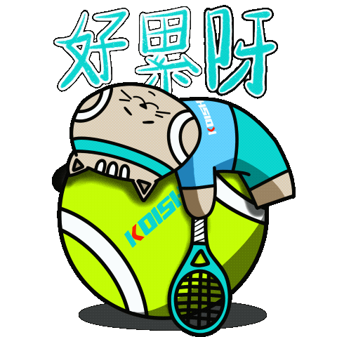
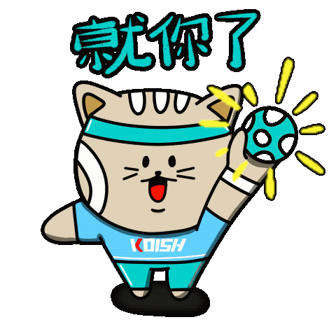
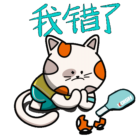
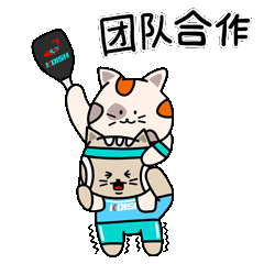
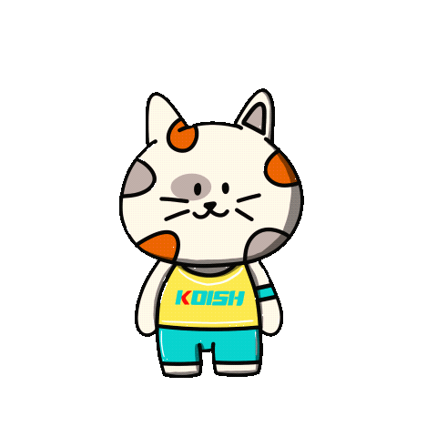
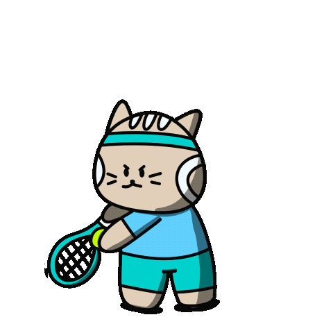
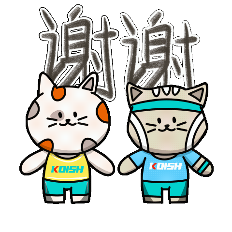
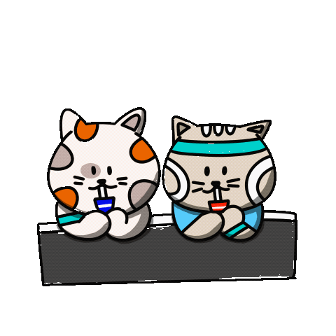
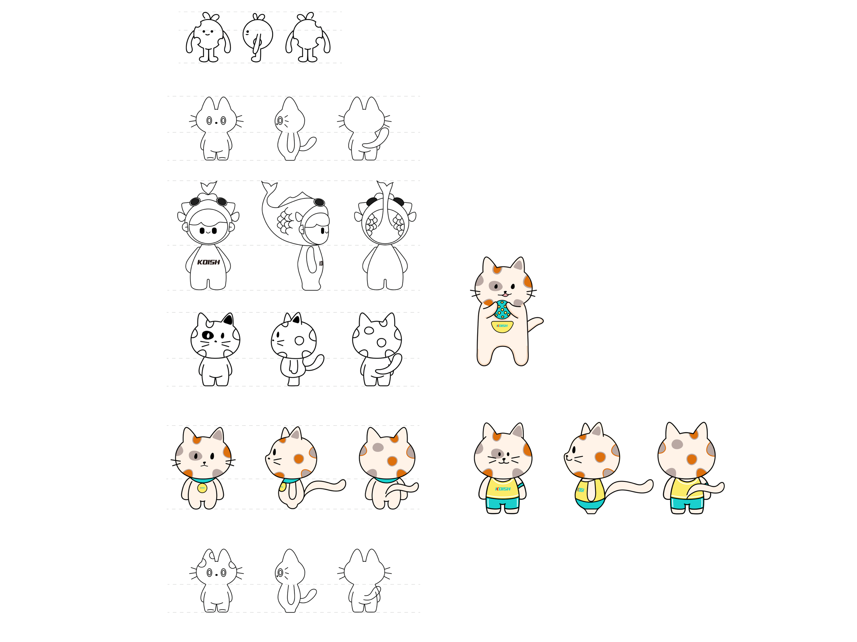
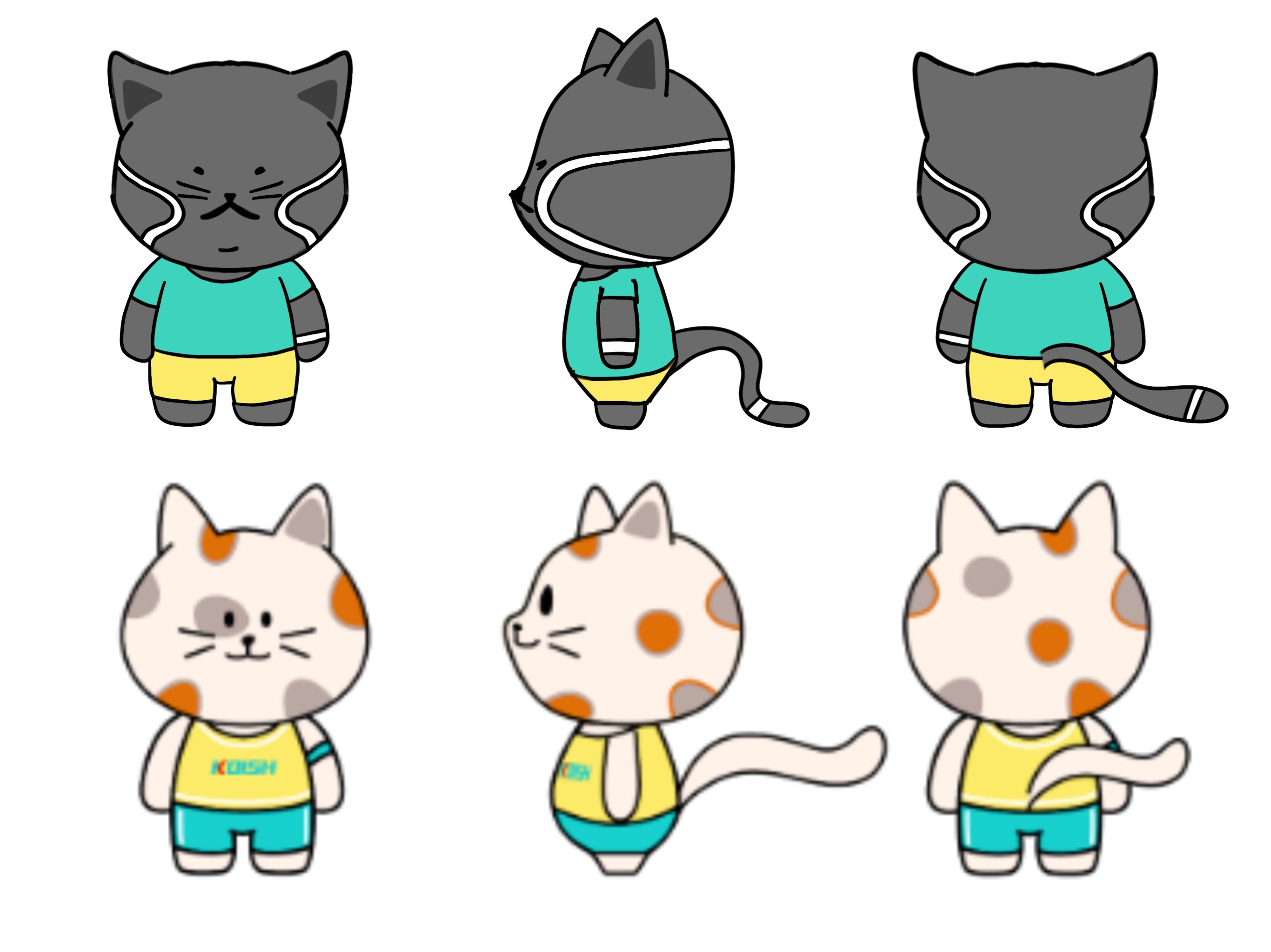
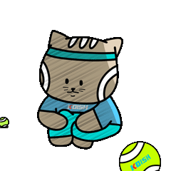
Once the pickleball cat was established, I noticed a gap. Koish operates both pickleball and tennis courts simultaneously, but the character only represented one sport. I proposed adding a second mascot — a tennis cat designed as a companion to the first, giving the brand a duo it could use across social media and marketing campaigns.

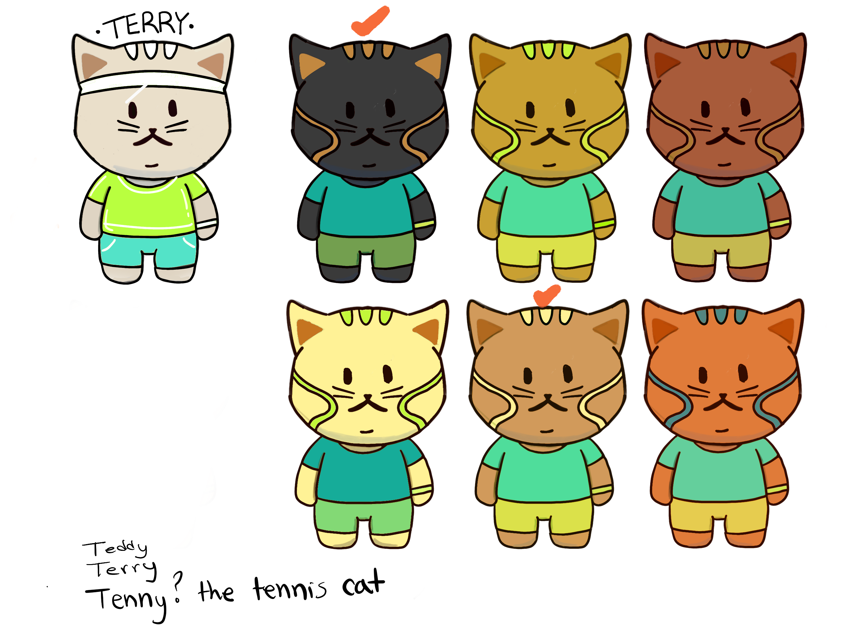
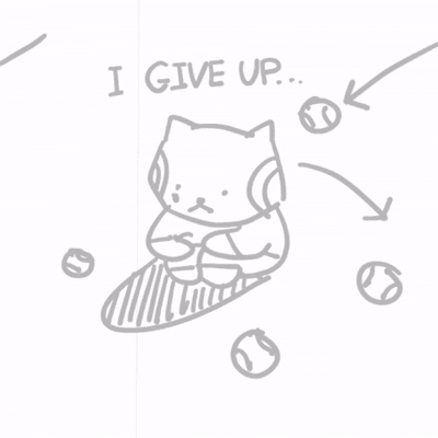
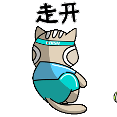
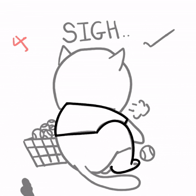
The stakeholders approved. I designed the tennis cat as a deliberate contrast to the pickleball cat. Where the pickleball cat is calm, cute, and easygoing, the tennis cat is energetic, competitive, and a bit of a bully. I explored multiple colorways for the tennis cat before landing on the final direction, testing warm and cool tones against the brand palette.
Sticker Ideation
With both characters defined, I moved into sticker ideation. I sketched over 30 concepts across three rounds, mapping out scenarios rooted in real sports moments — winning, losing, being tired, trash talking, encouraging a teammate. The goal was to design stickers that felt native to how people actually communicate during and after a game, not generic emoji replacements.

Each sketch was evaluated for animation potential, emotional clarity, and relevance to the Koish audience.
Animated Stickers
Selected concepts were taken from sketch to final animated GIF in Procreate. The sticker set covers a range of emotions and scenarios: celebration, exhaustion, apology, encouragement, and competitive trash talk. All text is in Chinese to fit the WeChat context and the target audience.
Examples of how it was made
Sticker Collection
Reflection
This project taught me that the best creative contributions often come from looking beyond the brief. I was hired to make stickers. I left having built a character universe. The proposal to add the tennis cat cost nothing extra to pitch and significantly expanded what the brand could do with its social presence.

If I were to take this further, the next step would be developing a campaign concept using both characters together — a series of short animated clips showing their dynamic in real court scenarios, designed for reposting and social sharing.