V+ Club Karaoke
V+ Club is a luxury karaoke lounge based in Richmond, focused on delivering an elevated, elegant experience to its guests. This project involved redefining the brand’s visual language to better reflect its premium positioning.

The scope included designing cohesive collateral such as the food and drink menu, business cards, promotional posters, and in-store signage—each crafted to enhance the overall customer experience and reinforce the brand’s sophisticated identity.
Project Timeline
March 2025 - May 2025
01. Color Renewal
The original color palette was composed of #000000, #FED500, and #53166D. This combination of colors conveyed boldness and playfulness but lacked the elegance expected from a premium brand. The bright yellow and saturated purple leaned more playful vibe, which diluted the sense of exclusivity and refinement V+ Club was striving for. 
The revised palette #1A1A1A, #FFD967, #C3943C introduces a warmer, more opulent tone. The gold evokes sophistication and prestige, while the deep background grounds the design in elegance. The subtle #FFD967 - #C3943C, yellow-to-gold gradient, provides visual interest without overwhelming the content, reinforcing the luxurious and elegant identity of V+ Club brand.
#1A1A1A
#FFD967
#C3943C
#FFD967 - #C3943C
02. Font Selection
Selecting typefaces for V+ Club presented a unique challenge, as the brand needed both English and Chinese fonts to effectively communicate with its bilingual customer base. One of the key challenges was finding a way to make the English and Chinese fonts work together harmoniously.

ZCOOL XIAOWEI was a perfect choice for headings and title with its eye catching design and compatibility with both English and Chinese.

LATO was used for the English content for its clean, versatile, and highly legible style.

To complement LATO and maintain a cohesive visual across bilingual content, NOTO SANS SC which offered a similar tone and structure.
Headings & Titles
ZCOOL XIAOWEI
HELLO WORLD! THIS IS A SAMPLE TEXT.
你好世界! 中文字体样式.
Content - English
LATO
HELLO WORLD! THIS IS A SAMPLE TEXT.
Content - Chinese (Simplified)
NOTO SANS SC
你好世界! 中文字体样式.
03. Logo Revamp
Objective
The original logo lacked clear visual cues that identified the business as a karaoke lounge. The goal was to refine the design to better reflect the brand's offerings and luxurious identity, while maintaining recognizability.
My Approach
The client provided a selection of stylistic references to incorporate into the redesign. They informed me the current logo was satisfactory except certain aspects — like how the "+" of their brand is represented with a star. When I was redesigning the logo, I ensured continuity while enhancing relevance and elegance.
Before
(Excuse the format/quality of the original. The client was not able to reach out to the original designer and this was the only file that was available as a reference.)
After
04. Food & Drink Menu
Objective
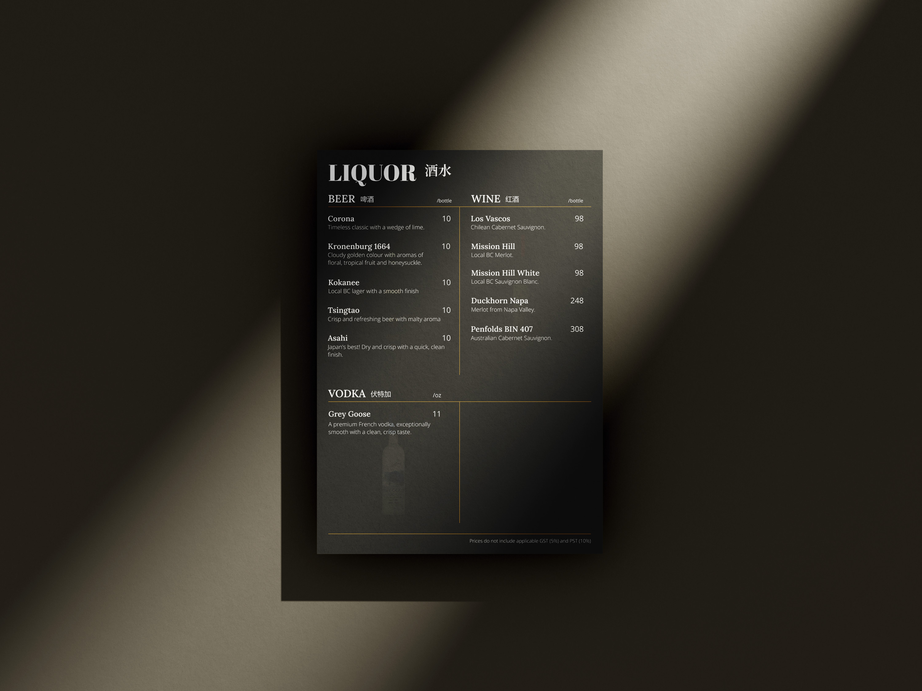
The food and drink menu was designed to reflect the luxurious ambiance of V+ Club while ensuring readability in low-light lounge environments. I prioritized a clean, structured layout that highlights premium offerings, complemented by elegant typography and subtle gold accents.
The Process
I began with layout sketches to establish the structure and user flow, followed by digital mockups tailored for print. Multiple iterations were tested in real-life settings to evaluate spacing, font sizes, and contrast—ensuring readability and visual consistency across all menu formats.
05. Promotion Materials
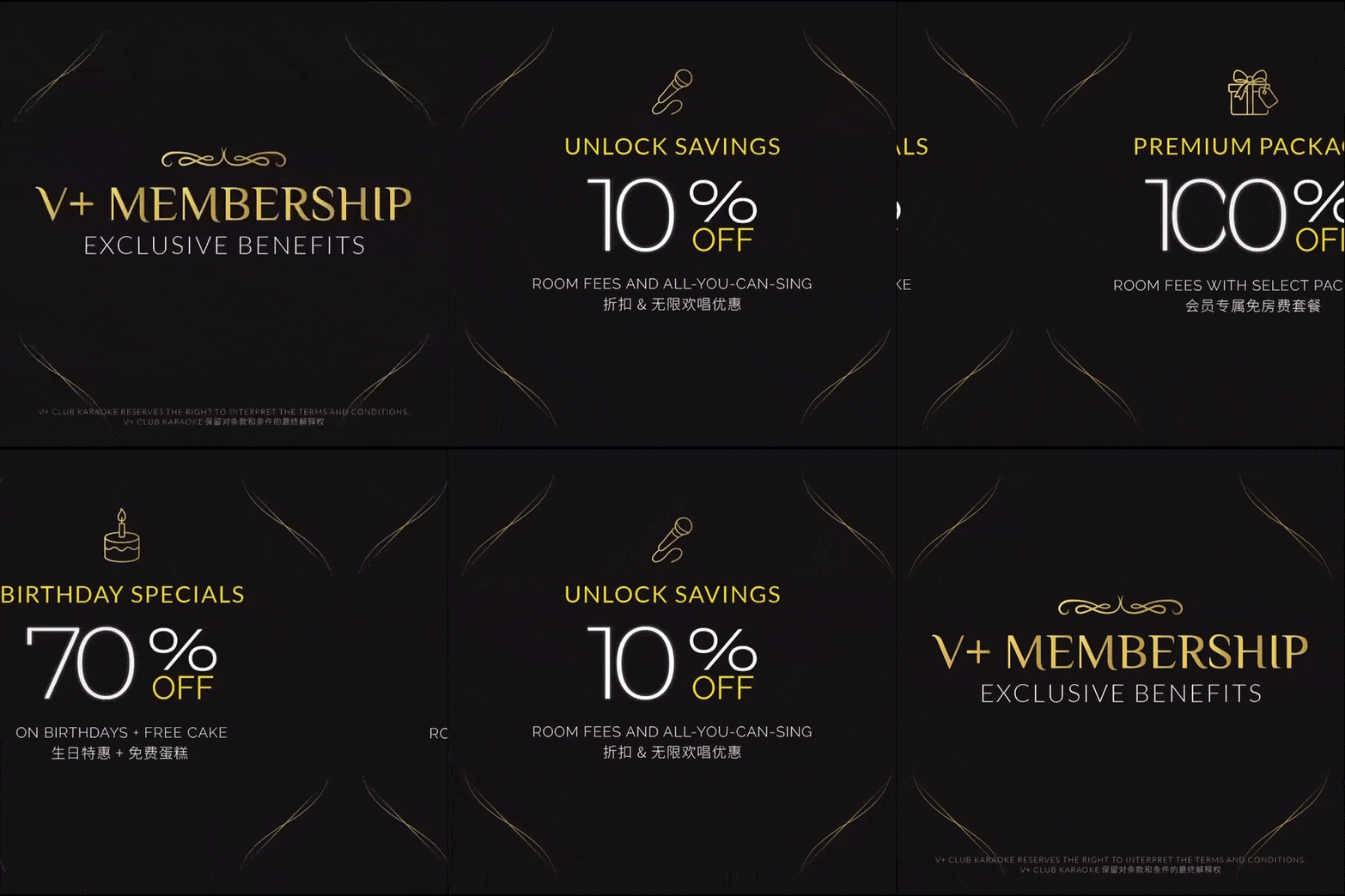
A cohesive suite of promotional assets was developed to promote the client's new membership program. These materials were tailored for both digital and print environments, each optimized for their respective contexts while maintaining brand language.
Print Collateral
Physical materials such as standing banners and reception desk displays were created to draw attention in-store. Using a vertical layout, font size, spacing, and gold accents were used in harmony to maintain legibility from a distance.
Social Media
Designed for platforms like Instagram, these assets focused on bold messaging. Carousel posts were used to promote user engagement through swipe-able formats, each highlighting key features of the promotion.
06. Business Card Design
In the final design showcase, we created mock ups of the logo usage, magazine designs, advertisement designs, and web designs.
07. Project Complete! Now what?
Working with V+ Club was one of the most rewarding experience. The biggest challenges was finding a balance between making everything feel luxurious while still being functional—especially across different formats like print, signage, and social media. Making sure the designs worked in both English and Chinese also pushed me to think more deeply about type and layout choices.

This project taught me a lot about building flexible brand systems and designing for real-world spaces. I also learned the value of testing in context—like checking readability in low-light settings and adjusting details based on how people actually interact with the materials.

From here, I’m hoping to continue supporting the brand, especially through digital updates like their website and future campaigns. A key focus will be solidifying their brand language so that it remains prominent and consistent across all touchpoints—whether it’s print, digital, or in-store. I’m also excited to take what I’ve learned into new projects with a sharper eye for how design can elevate everyday experiences.