The Problem
No Interactive Visualization
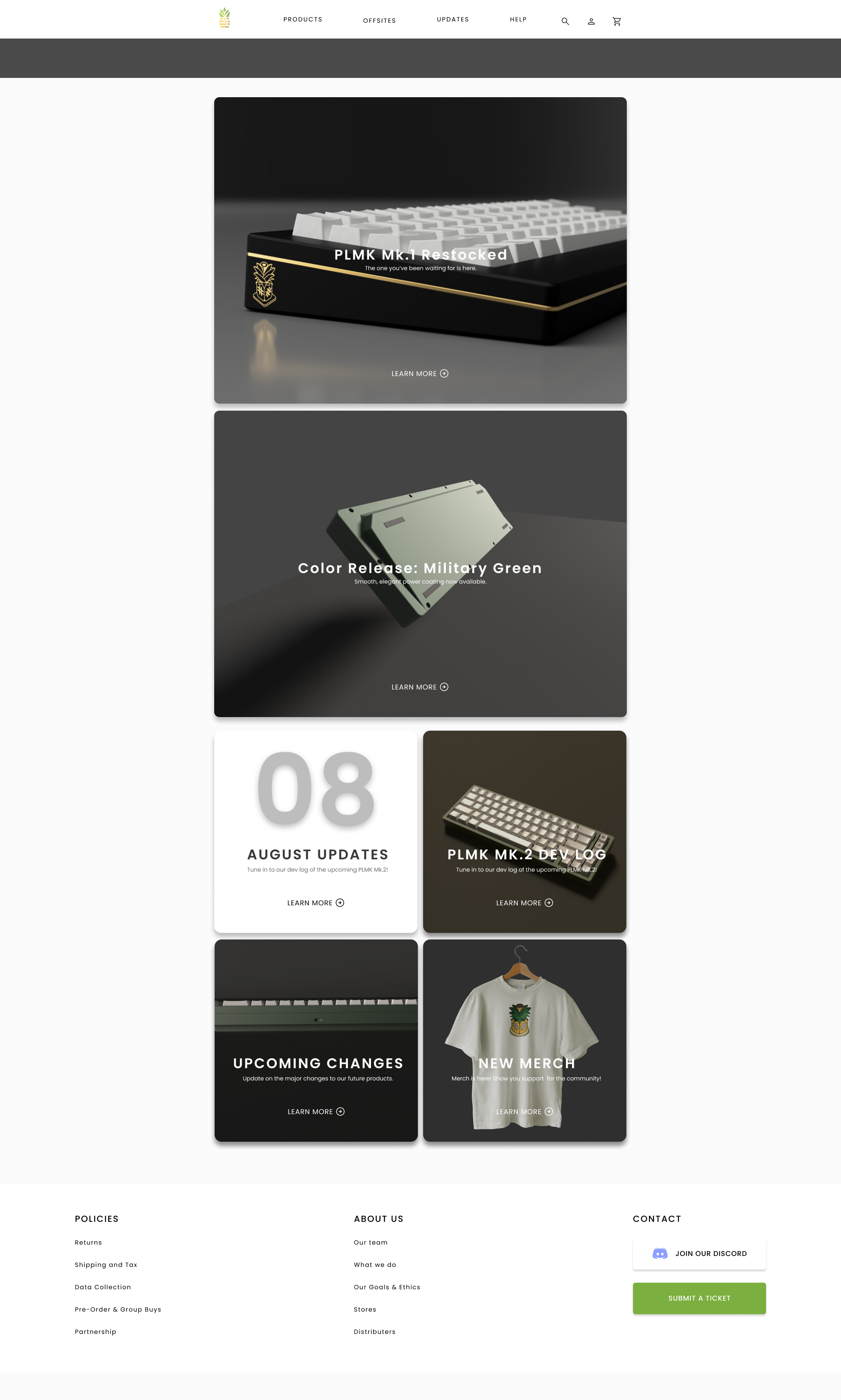
Buying a custom keyboard online means making a lot of decisions: size, color, materials, sound profile. All without being able to see or feel any of it. Most platforms gave users static images and a spec list. That was it.
If you wanted to know how your keyboard would actually look, sound, or feel before buying, you were on your own. Searching through forums, YouTube videos, and third-party sources that were often inconsistent and unreliable.
This gap between expectation and reality was the core problem. And it worked directly against what Pineapple Lab was trying to be: the most accessible entry point into the hobby for newcomers.
Elevating Online Shopping Experience
Conclusion
Learnings
This project pushed me to think about how to see traditional method of information presentation in different ways. Through feedback and critiques from usability tests, I learned that visual animation and feedback can take user engagement and satisfaction to a different level.
It also reinforced something I carry into every project now: the most impactful design decisions aren't about aesthetics — they're about understanding exactly where users lose confidence, and removing that friction.
Measuring impact
The designs were validated through hi-fi prototype testing with 8 participants — the same cohort from the original research. Purchase intent improved by approximately 30% compared to participants' experiences with existing platforms, and self-reported frustration with the customization process dropped by around 20%. These were informal measures from prototype testing rather than live data, but they directionally validated that closing the visualization gap was the right problem to solve.
When the website launches, the metrics I'd track to confirm this at scale: conversion rates on the product customization flow, drop-off points in the checkout process, and post-delivery satisfaction scores — particularly whether customers felt the product matched their expectations. That last one maps directly back to the research finding that 50% of users had received keyboards that didn't match what they'd imagined.
Whats Next?
The immediate next step is developer handoff and launch. Post-launch I'd prioritize two things: a dedicated mobile experience, and a usability study specifically focused on the group order flow — it's the most complex interaction in the product and the one with the least testing time given the project timeline.


.gif)


