ARTOUR
Artour is a self-initiated project I designed from scratch — solo, end-to-end.

The goal: reimagine how people experience art galleries and museums, both in-person and virtually, with a focus on accessibility that existing apps had largely ignored. I owned every stage of this project — from competitive analysis and user interviews through wireframing, prototyping, and usability testing. This is the project that pushed me deepest into inclusive design thinking, and where I learned the most about the gap between what designers assume users need and what they actually experience.
skills
Mobile UX · Accessibility · UX Research · Self-initiated
date
July 2023 - August 2023
Research
To understand the problem space, I ran a competitive audit of three major museum apps — Walt Disney Family Museum, Art Institute of Chicago, and St. Louis Public Library — and conducted interviews with 5 participants aged 19–60, who shared their experiences with art galleries and audio tours.

Three things stood out from the research: audio tour apps consistently lacked accessibility features like subtitles and translation; virtual tours were being used as a substitute for in-person visits, not just a supplement; and there was no universal app that worked across galleries worldwide — every venue had its own.

Competitive Analysis
The three competitors researched in the audit were Walt Disney Museum, Art Institute of Chicago, and St. Louis Public Library. They all had the similarity of having a digital (or virtual) experience of an art gallery or a museum. However, Walt Disney Museum's app provided me with many insights since it was a large corporation and their app was meant to be used when the user is experiencing the displays & installments both virtually and physically.
Walt Disney Family Museum
+ Simple & easy to use
+ Multiple languages available
+ Search installments' serial number on the app
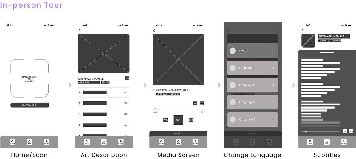
+ Information and audio tours are organized by chapters
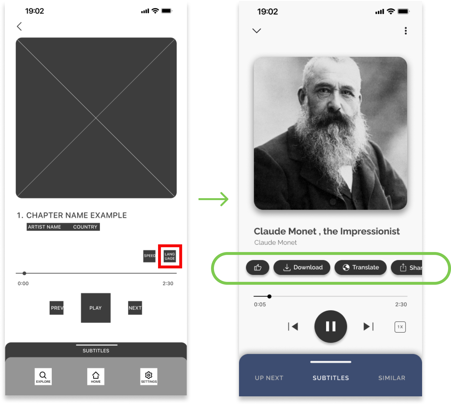
- No closed caption available for audio tours
- Serial code formats are series of number which can be a hassle to find & type.
St. Louis Public Library
+ Straightforward user flow
+ Audio tracks include subtitles (Text-to-speech)
- Requires library card or account to use
- No other language available other than English
- Poor image quality
Art Institute of Chicago
+ List of features and arts the user can expect
+ Search art work's serial code for more information
+ Multiple languages available
- Cannot listen to the audio book and view the subtitles spontaneously
- No option to further explore about the art
- Limited number of language available
Interviews
Out of the 5 interview participants: 3 were non-native English speakers, 3 used accessibility features regularly, and 2 visited galleries on a regular basis. The interviews were held virtually through Zoom or Discord, which lasted around 30 minutes each session. The interviewees were asked questions of past experiences with similar applications, frequency of using the any art gallery apps, frequency of visiting galleries physically, and any pain points or enjoyable moments of physical & virtual art gallery visits.
What did they say?
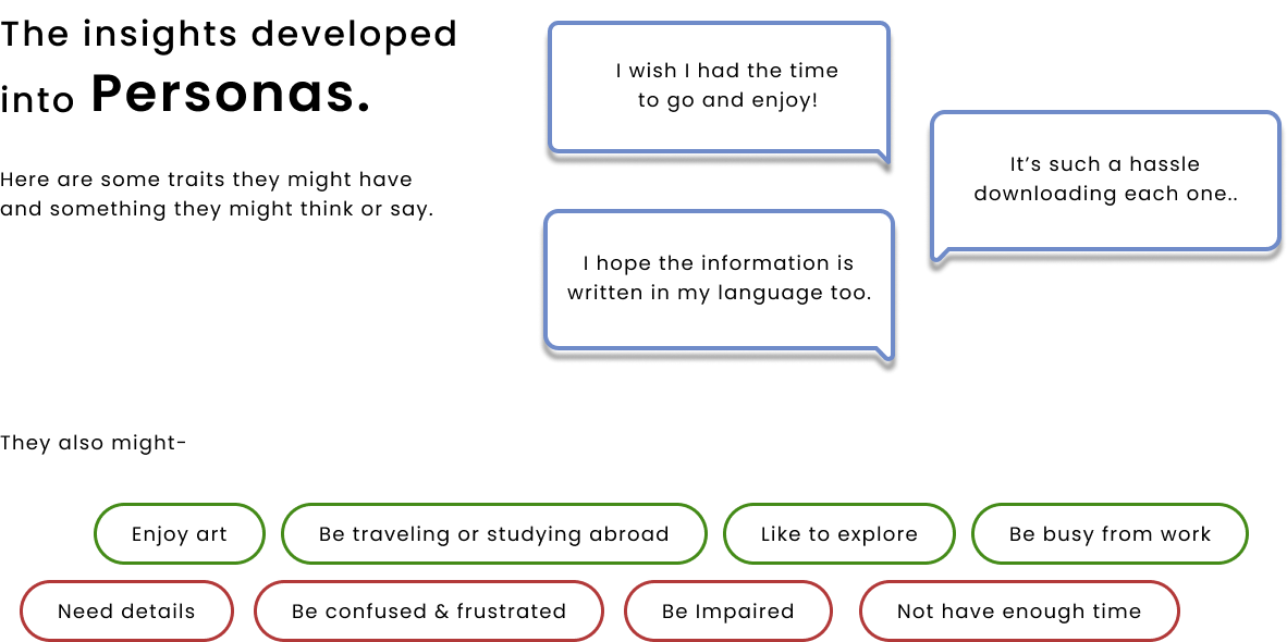
Non-native English speakers mentioned that they often had trouble fully comprehending the meaning of the installment even with a tour guide or audio tour.
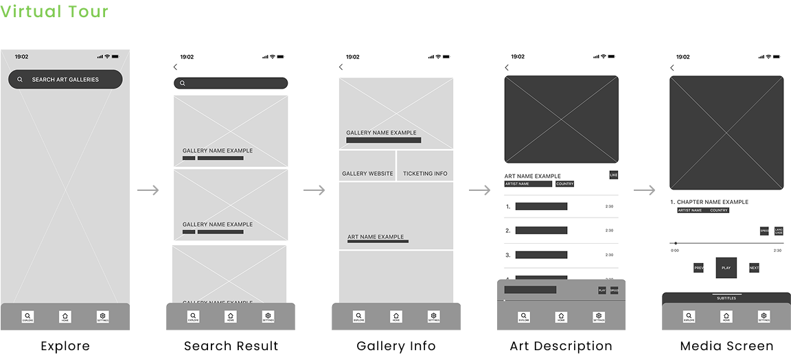
Those who often visit the galleries use the virtual experience as a substitution of the physical experience. It helps them decide if the current exhibition is interesting for them to go see it in-person.
Pain Points
Two findings from the interviews stood out above everything else. Non-native English speakers described feeling locked out of the full experience even with an audio tour available. And frequent gallery-goers were using virtual experiences not as a supplement, but as a decision-making tool — to decide whether an exhibition was worth seeing in person. Neither use case was being served well by any existing app.
Pain point #1
Lack of subtitles and translation. Poor accessiblity.
Only few of the competitors provided multi-language support and closed captions. To add, no competitor that was analyzed provided audio translation.
Pain point #2
Apps are not universal. Serial codes are a hassle.
Being able to search the desired information is great, but typing and searching a series of non-intuitive serial code can't the best experience the users go through.
Pain point #3
Information given are limiting or overwhelming.
Either the information is very short and does not allow users to explore more about the work, or there are too much information in one single section that it becomes overwhelming.
User Flows
The research revealed two distinct use cases that needed their own flows — a user experiencing a gallery in person, and a user seeking a remote virtual experience. I mapped both before touching any wireframes to make sure the information architecture served each scenario without forcing either user into an awkward path.
Flow #1
In-Person Flow
Flow #2
Virtual Flow
Wireframes
After mapping the flows, I moved into paper wireframes first to work through layout and hierarchy quickly before committing to digital. Once the structure felt right, I moved into lo-fi digital wireframes and built a testable prototype.
Usability Testing
I ran two rounds of usability testing — once on the lo-fi prototype and once on the hi-fi prototype. Participants were asked to complete the two core flows (in-person and virtual) in an unmoderated environment. The lo-fi round confirmed the overall flow worked without major issues. The hi-fi round surfaced two specific problems worth acting on:
Finding #1
3 out of 5 participants could not find the language change button on the media screen.
They navigated to the settings tab instead — a behaviour carried over from other apps. Root cause: the button had low visibility and didn't match users' existing mental models.
Fix #1
The Action Bar
To solve the language button visibility problem, I redesigned the media screen around an action bar — a cluster of key actions grouped in the most visible area of the screen. Rather than scattering buttons across the interface, centralizing them in one place makes features discoverable without requiring users to hunt. The language change button is now part of this cluster, impossible to miss.
Finding #2
2 out of 5 participants expected a filtering or sorting feature
When exploring screens like "Explore" and "Liked Works" pages, they found scrolling throuhg unfiltered content very frustrating.
Fix #2
Category Tags + Sorting
To solve the filtering problem, I introduced a category tag system — similar in concept to hashtags — that organizes artworks by style, artist, origin, and more. I also added sort and filter controls to the Explore and Liked Works pages. As a bonus, the tag system opens the door to personalized recommendations based on what a user has previously viewed or saved.
Designs & Features
Feature #1
Translations of audio and subtitles
This was the feature no competitor had built — and the one that came directly from what interviewees told me. Non-native speakers weren't struggling because the content was bad; they were struggling because it was only available in English. Adding audio translation with synchronized subtitles meant users could finally experience a full audio tour in their own language, without compromise. I also included text resizing as part of the same accessibility layer, addressing visual impairment needs in the same flow rather than siloing them.
Feature #2
Image scanning of the artworks
Serial codes were a consistent frustration across every competitor I audited. Users had to find a small number, type it correctly, and hope it matched. Image scanning removes that friction entirely — point your camera at the artwork and the information appears. It also makes the app genuinely universal, usable in any gallery worldwide without needing a venue-specific code system.
Feature #3
Categorize information & provided only desired information
Interviews revealed a tension: some users felt existing apps gave too little information, others felt overwhelmed. The answer wasn't more or less — it was structured choice. Organizing content into chapters lets users self-direct their depth of exploration, which respects both the casual visitor and the deeply curious one.
Prototype
Design Systems
Before building hi-fi screens, I defined a UI foundation — color tokens, typography scale, button states, a media player component, and navigation patterns. Establishing this upfront meant every screen stayed consistent without having to make the same decisions twice. It also made the prototype significantly faster to build.
Reflection
What did I learn?
Designing Artour solo meant I had to hold the full picture at every stage. That constraint made me more rigorous — when you're both the researcher and the designer, you develop a stronger instinct for which insights are actually actionable and which are interesting but irrelevant. The biggest shift in my thinking came from the accessibility research. I went in expecting accessibility to be a feature layer added on top of a finished experience. What the interviews revealed was the opposite: the users who needed accessibility features most weren't a niche edge case. Non-native speakers, older visitors, people in noisy or crowded environments — designing for them improved the experience for everyone.
What I'd do next
1. Research how AR features could enhance the virtual tour experience
2. Conduct further usability studies to validate the iterated solutions
3. Run a dedicated research round with non-native English speaking participants — my testing pool skewed toward fluent English speakers, which means the translation feature I'm most proud of is also the one with the least direct validation. That's the honest gap, and it's where I'd invest the next round of research.
Measuring impact
If Artour were to launch, I'd track: translation feature usage by language, closed caption engagement and font size data, usability error rates across key flows, and virtual tour engagement compared to in-person usage — the last one would help validate whether the virtual experience is genuinely serving the remote-first use case the research identified.